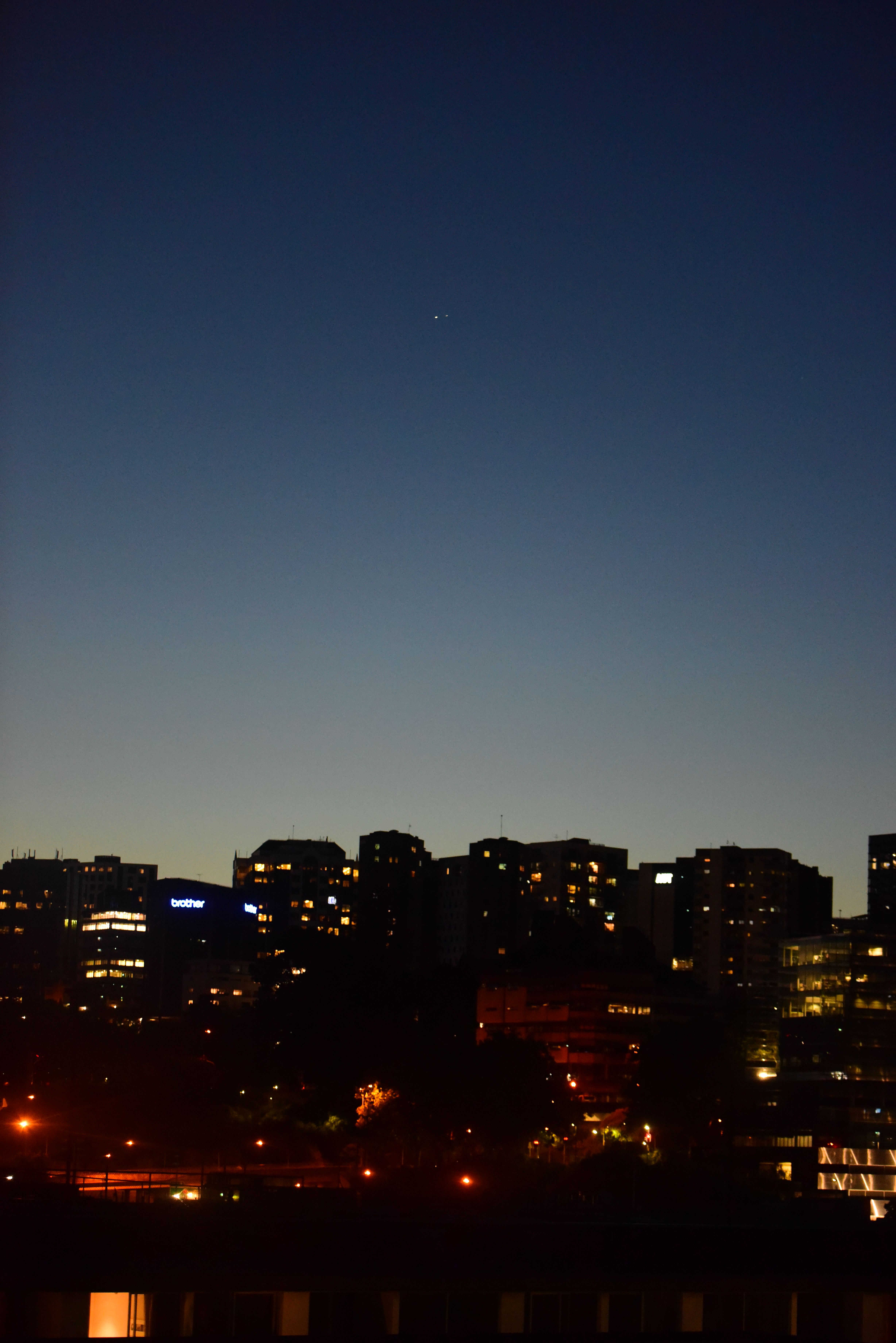
Doing “astrophotography” in New Zealand for the past while has definitely been character building: the composure and patience required to stand on the beach for half an hour waiting for a gap in the clouds do not come naturally to me.

Doing “astrophotography” in New Zealand for the past while has definitely been character building: the composure and patience required to stand on the beach for half an hour waiting for a gap in the clouds do not come naturally to me.
Omitting the orbital technicalities by a great deal, a conjunction between Jupiter and Saturn (A Great Conjunction) happens steadily over history, and humans have been keeping track of them since at least the time of Kepler. From the perspective of the sun, Jupiter takes 11.9 earth years to complete one orbit, and Saturn 29.5 years. This means that they line up roughly every
(29.5*11.9)/(29.5-11.9) ≈ 19.9 years.
Conjunction has to be able to be observed on earth to count, and this complicates matter a bit further, causing the exact moment of each conjunction event to vary by up to a few months.
From the perspective outside the solar system, we see that, when the two outer giant planets seem close together on earth, earth itself, jupiter, and saturn, almost coincide on a straight line, as illustrated below.
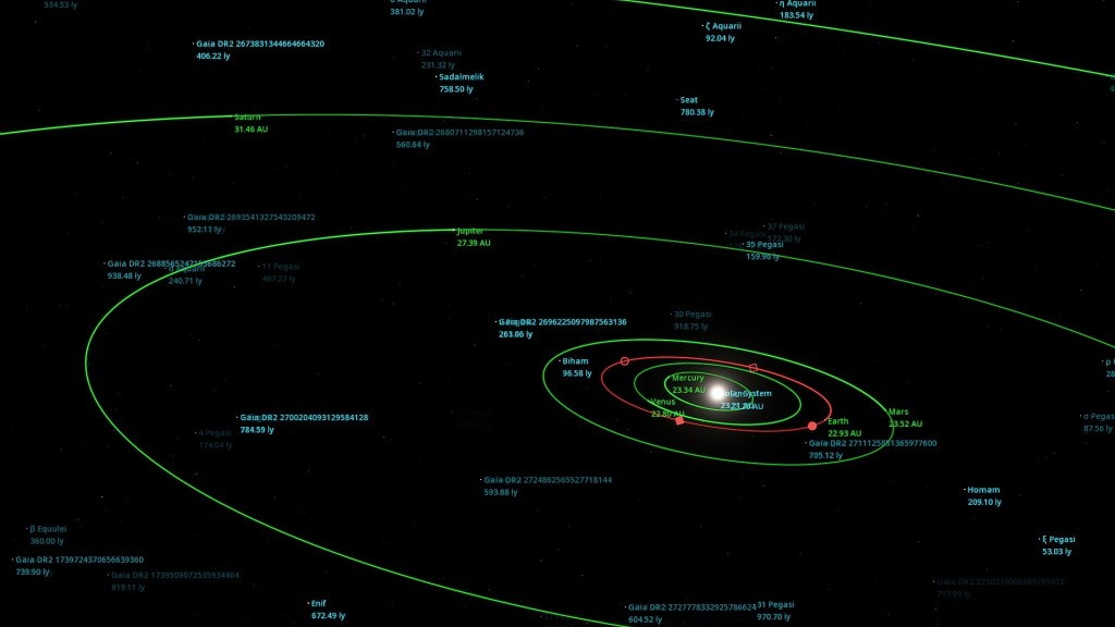
In reality, this line almost always point near the sun, and hence the two exterior planets are rarely well-separated enough from the sun to allow for a good observation session on earth. For example, the last Jupiter-Saturn conjunction was May 28, 2000, but this happened behind the sun. Last time Jupiter and Saturn appeared this close was July 16, 1623 — this conjunction in the lifetime of Galileo also took place behind the sun, and hence was unlikely to have been studied. In short, the previous comparable event to the one tomorrow dates all the way back to March 4, 1226 [1].
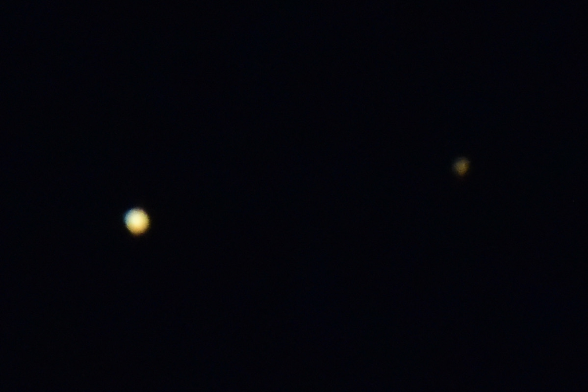
For people with a telescope, the rings of Saturn and the moons of Jupiter can appear in your view at the same moment, creating a sensation that hundreds of millions of kilometres of separation giving way to celestial coincidence.
Below are some observation tips from NASA:
Find a spot with an unobstructed view of the sky, such as a field or park. Jupiter and Saturn are bright, so they can be seen even from most cities.
An hour after sunset, look to the southwestern sky. Jupiter will look like a bright star and be easily visible. Saturn will be slightly fainter and will appear slightly above and to the left of Jupiter until December 21, when Jupiter will overtake it and they will reverse positions in the sky.
The planets can be seen with the unaided eye, but if you have binoculars or a small telescope, you may be able to see Jupiter’s four large moons orbiting the giant planet.
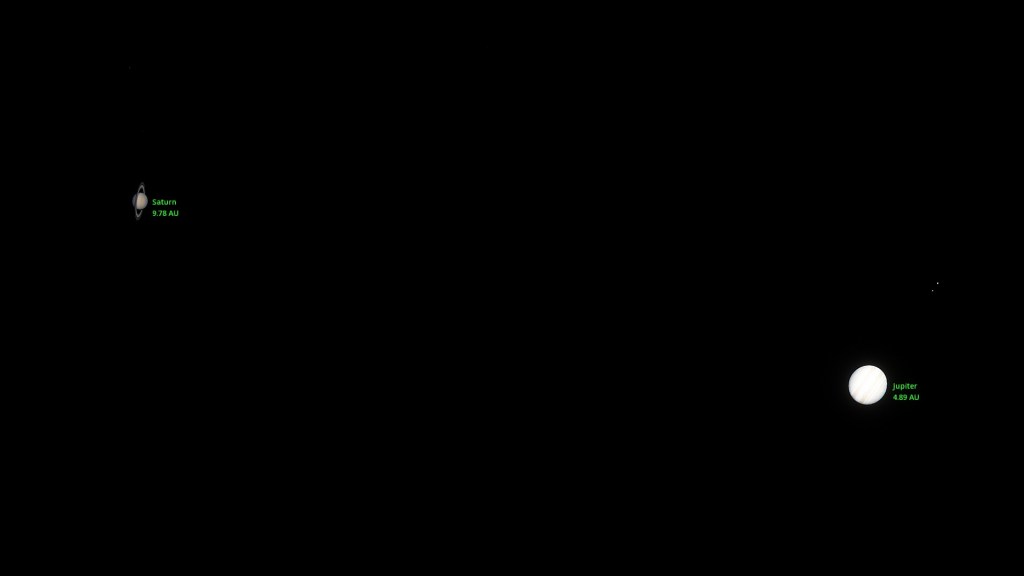
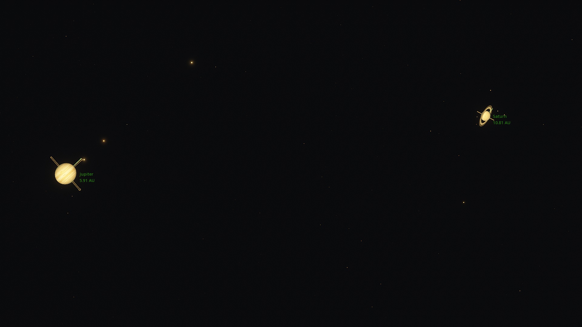
And here are some preliminary results that I rendered / photographed in the night of December 20, 2020.


[1] List of Great Conjunctions between 1200 and 2400 AD, Wikipedia
(Realize that back then nobody on earth was using the modern Gregorian calendar, so pinpointing the exact date is as much a historical venture as it is astrophysical.)
And happy Solstice to my readers around the world. You probably won’t hear from me until 2021, so all the best in the new year. The hopes and dreams of humanity won’t just be put off by nature like this, I am fully convinced.
(Little Demo 04 has been set to private after I realised its pointlessness without full mathematical working … it will be back online soon with additional theory.)
Their diverse shapes and forms notwithstanding, many modern plants embody self-similarity: big branches give rise to small branches, small branches give rise to leaves, and leaf stems break into primary, secondary and tertiary level veins in a similar fashion.
You might wish to point out that this self-similar pattern does not go on forever. Plants are made up of cells, after all. While their own subdivision into subatomic particles still promises a long way ahead of us, that there exists a smallest unit necessitates a definite end to the hierarchy.
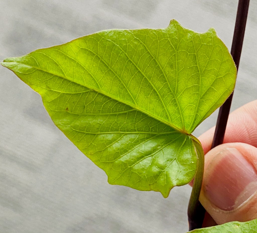
On this note, if you’ve observed a leaf under a magnifying glass, you might recall the following: at cellular levels, a leaf looks like an orderly tessellation of polygons. I seem to have misplaced my own microscope a long time ago, so here’s a picture from Wikimedia to get ourselves on the same page.

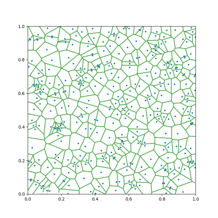
To me, the best way to describe this net-like tessellation pattern, is to state that they resemble a mathematical object known as a Voronoi diagram.
What is that? What does it have to do with leaves? And — so that this post is a demo and not exposition — can you reliably replicate this kind of pattern by hand?
The Voronoi diagram was discovered by Russian mathematician Georgy Voronoy (1868 – 1908). Some call it the Thiessen polygons, after American meteorologist Alfred Thiessen (1872 – 1956).
It has since found applications in a variety of scientific fields, such as meteorology, geoscience, condensed matter physics, and computational graphics. In recent times, people have also found them handy for things like modelling cellular signal coverage, or the spread of a pandemic.
At its core, a Voronoi diagram solves the following spacial division problem:
If I have a pancake and sprinkle on it a certain number of candies. How should you cut the pancake, such that:
In slightly more technical terms, the Voronoi diagram for a domain in ℝ2 and a set of points, divides the domain into regions according to which point is the closest.
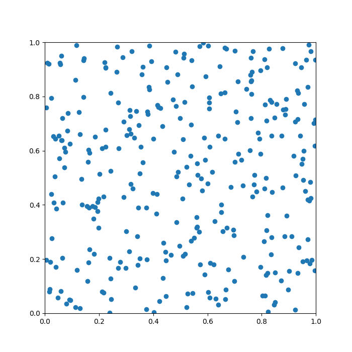
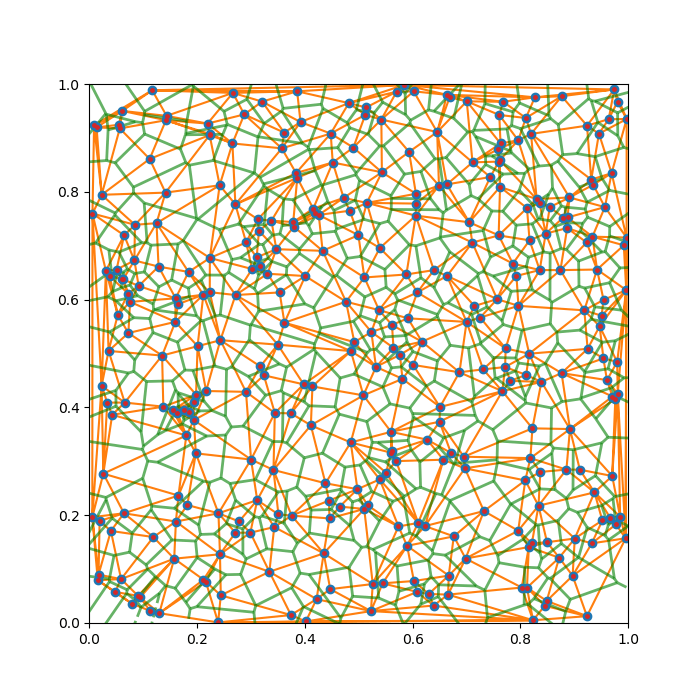
To help you understand the task, I produced a quick example below. Here, the pancake is the unit square, [0,1] × [0,1], and there are 20 points randomly sprinkled on it. The green lines are the Voronoi diagram generated from this setup.

Does it look a bit leafy already? The story is just getting started …
Tackling a general case outright may be daunting and/or confusing, so let’s start slowly. Say, we have two candies, A, and B, and wish to construct the Voronoi “single cut” for this scenario to meet our criteria above. How should we do it?

Re-interpreting the task, we want all points lying on our cut to have a equal distance to the two candies. This way and this way only, all other points falls to the correct side of the cut.

Once we’ve understood this, recollecting grade-school geometry a bit, we realise that the only cut that does job is the perpendicular bisector of the segment joining the two candies. And with this, naturally comes a method of constructing a Voronoi diagram.
Thematically, we join all nearby candies with straight segments, and just plot the perpendicular bisectors of those segments. This guarantees that our original criteria are met locally, between any pair of nearby candies. To ensure the global satisfaction, in other words, to choose the correct pairs of candies to bisect, we need to employ the technique known as Delaunay triangulation (DT).
In 2D, DT is a way of making triangles out of a set of given points that globally maximises the smallest angle in all the product triangles. In other words, it disfavours “highly acute” triangles. This algorithm is named after another Russian mathematician, Boris Delaunay (1890 – 1980), and it is readily implemented in all modern scientific computing software (to be frank, Voronoi is too … )

Complete.
Despite how much of my childhood was spent “wanting to study plants”, I am no botanist, and this section is mainly a fascination-speculation potpourri.
To begin, for a developing leaf, the “pancake” is a region prescribed by some major leaf veins.
So, what are our candies in this context, and why Voronoi?
The eventual appearance of the leaf at our current scale of interest is partially determined by where the slowest growing group of cells is, as it — by definition — expand the slowest and creates some kind of dynamical tension on the network of the leaf veins during growth.
If we assume that the nutrients from the veins diffuse down a steady gradient within the leaf, we realise that cells farther from all its nearby veins will grow slower, and this trend will be symmetric around all veins. As such, the “candy” in this scenario corresponds to the patch of cells where the cell division / growth is the slowest.

In fact, wild Voronoi diagrams show up a lot in nature: the wing pattern of insects, a dried riverbed, and the body patterns of giraffes and sea-turtles.


Some of these probably link back to similar mechanisms as the leaf example — any 2D division problem where the speed of growth / change / colouration is linked to the distances from the “veins”, has the potential to approximately produce a Voronoi diagram.
Of course, there exists another interpretation of the Voronoi diagram. I will be amiss not to mention it.
Rather than being a logical result of constraints at the vein, we can get Voronoi if we constrain the candies instead. Say that you start to blow an (ideally elastic) ballon at each candy, and make them grow at the same rate, then the resulting boundary of these ballons will, again, be the Voronoi diagram for your initial point configuration.


As is hinted above, one can get some genuinely beautiful Voronoi diagrams if one generates Candies non-randomly.
As a start, this web designer has a page that allows you to generate Voronoi diagrams interactively for an arbitrary set of exponential spirals. A screencast of me playing with this website is shown below.
Incidentally, when you choose the golden angles (≈ 137.5 degrees) for your spiral, the Voronoi grids will approximately match the distribution of sunflower seeds, or the skin bumps on a ripe pineapple.
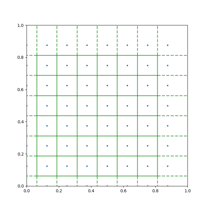
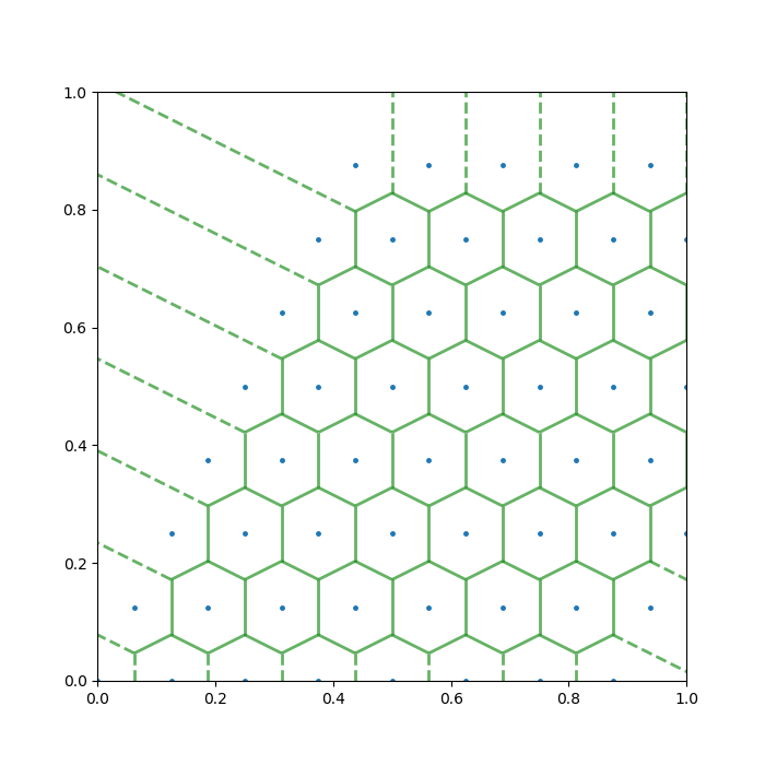
On another direction, the Voronoi grids due to 2D crystal structures can be fun too. I produced two examples below.
A mathematician should hardly be content with the Voronoi diagram as we’ve introduced around here. There are ample things left for the interested reader or aspirant researcher to generalise, and I would like to list a few:
Many modern architects look to this flavour of mathematics for inspiration, and my favourite example may be the National Aquatics Center in China, the Water Cube. All of its side walls are made up of Voronoi diagrams, while physically it also resembles a box of soap bubbles — a 3D analogue of Voronoi diagram.

A bunch of sunspots has emerged following the recent conclusion of the solar minimum. Quoting one of my astronomer friends based in Western United States, a powerful solar flare now would be a fitting end to 2020… To that I say, don’t forget backing up your critical data and communication lines.
Anyways, here are two sun pictures taken between my teaching and office work this afternoon.
Speaking of the sun, this is the beginning of the third solar cycle in my life!
… And if you measure like that, human lives are comically short.


This was a cancelled “Work-At-Home” experiment for physics undergraduates, due to local weather conditions, and a second thought that this project is better suited for high school students.
You may skip to the next section if you are comfortable with analytic geometry or related mathematical fields.
If you use a plane to cut the surface of an infinitely extending cone, the resulting curve of intersection is called a conic section. Depending on the relative positions of the plane and the cone, you might get an ellipse, a parabola, or a hyperbola.
On the Cartesian plane, any quadratic equation of x and y (as long as it’s not degenerate) corresponds to a conic section. That means that all conic sections follow the form:
Ax2 +Bxy+Cy2 +Dx+Ey+F =0
The earth orbits the sun with a persistent axial tilt of roughly 23.5 degrees. As a result, the latitude at which the sun directly shines overhead at solar noon (the subsolar point), oscillates between -23.5 and 23.5 degrees during the course of a year. You might have seen these photos from tropical regions, such as Hawaii, where the shadows of things disappear on certain days at noon, giving you a surreal feeling.
On this note, the long-superseded Geocentric view of the universe did leave one practical legacy: for the slow-moving creatures on the surface of the planet such as ourselves, thinking like Ptolemy of Alexandria gives us a useful framework to describe the paths that celestial bodies take during the day.
A sphere is locally flat, and so we picture the ground on which we stand as the x − y plane, with positive x- direction being east and positive y-direction being north. Readers in the Southern Hemisphere can simply flip the signs.
We then regard the rest of the universe a large sphere that surrounds us. It has two poles that are directly above the earth’s north and south poles, and the ground plane cuts into it, forming a hemispherical “sky dome”. All celestial objects, the sun included, trace almost circular paths on the dome as a result of the earth’s rotation.
This coordinate system is illustrated below.

The northern celestial pole conveniently has a bright star system nearby – Polaris – and deducing one’s latitude would be as simple as measuring the elevation angle of that star. That’s not relevant to today’s little demo, of course.
In the coordinate system defined above, we can consider a rod of unit length standing upright relative to the ground.
Assuming the earth is perfectly spherical, it is not hard to show that the tip of the rod’s shadow will move on the ground according to the following equation,
(x2 +y2 +1) sin2a=(ycosb−sinb)2
This is a family of conics (one or a pair) parametrised by two angles:
Henceforth, if we can get the curve traced by the shadow on the East-North coordinate system, we may employ nonlinear curve fit to find a and b. In other words, we can locate ourselves in space and in time (restricted to somewhere on contemporary earth …) by staring at shadows.
Of course, to see shadows change with your own eyes, you must be very bored and wait for hours. So we stare at the model instead, like happy little theorists that we are.
For most of us, notice that the a and b combinations usually describe a hyperbola, going readily to infinity to both sides, which corresponds to sunrises and sunsets. At the same time. it never hurts to remind ourselves that, when the length of the shadow is comparable to the curvature scale of the earth, our model breaks down.
For high latitudes, it’s actually possible for the tip of the shadow to trace an ellipse, which corresponds to the Midnight sun, where the sun never sets during summer. Of course, the transition case of a parabola is also possible. Question for you: Where and when does that occur?
I’ve prepared an interactive notebook (with one extra simplification model where we work out a values according to day of the year):
Demo on Desmos Graphing Calculator.
I skipped a lot of historical contexts in the interest of time, but as you may have guessed, what I described here is exactly how sundials work…
Lastly…
Take this, flatearthers!
(I was one of them until I realised some F. E. believers were actually serious… Is this a hint of the next Aperiodical blog post?)
In Series …
Photo stories
Artistic, scientific, social, or otherwise nontrivial moments that I freeze, served with related thoughts.
The order of nature that we find ourselves developing from, is sometimes contrasted with the order that we strive to construct for ourselves after (and despite) realising the frequent lack thereof if one is ever not careful.
I thank the language of physics for unifying my appreciations of both.
…we give little thought to the machinery that generates the sunlight that makes life possible, to the gravity that glues us to an Earth that would otherwise send us spinning off into space, or to the atoms of which we are made and on whose stability we fundamentally depend…
Carl Sagan, Introduction to A Brief History of Time, 1st Ed.
In another recent note, 366 days ago, I turned in my honours / senior thesis, and wrote down the first paragraphs of my statement of purpose in hep-th. So much for that thought, but I am glad I kept going in physics.
— And I got to sneak into the same mathematics office again in order to recreate a one-year-old photograph. Try the new slider widget below!


What’s so bright in my eyes?
The ceiling lamp.


